
My Invisalign Patient App
My Invisalign Patient App
Design lead @ Align Tech Inc.
Design lead @ Align Tech Inc.
Jan 2023
Jan 2023
Invisalign, produced by Align Technology, offers clear aligners and has been used to treat over 15 million patients globally.
I led the redesign of the patient app, owning every aspect of the product design - from defining problems to conceptualizing solutions, prototyping and conducting research.
This project is currently in development.
THE CHALLENGE
THE CHALLENGE
My Invisalign app for patients was relatively untouched for years. The app had glaring usability violations, inconsistencies and bugs that frustrated the users. While the business team were keen on giving the app a quick refresh, we needed to recalibrate our focus and rebuild the app from ground up.
Our challenge was to create a simple, guiding and scalable experience to help patients accomplish their treatment goal.
BACKGROUND RESEARCH
BACKGROUND RESEARCH
Marketing team had consulted with 3rd party agency to conduct need finding study for patient experience. I joined the project only after that so didn’t get to participate in that research activity. However, i meticulously listened to all of the user sessions to create a comprehensive user journey and conducted heuristic evaluation to uncover usability violations.
Marketing team had consulted with 3rd party agency to conduct need finding study for patient experience. I joined the project only after that so didn’t get to participate in that research activity. However, i meticulously listened to all of the user sessions to create a comprehensive user journey and conducted heuristic evaluation to uncover usability violations.
Key findings
Key findings
Remind me to wear and change aligners on time
Show me my treatment progress
Help me stay on top of my treatment tasks
Remind me to wear and change aligners on time
Show me my treatment progress
Help me stay on top of my treatment tasks
THE SOLUTION
THE VISION
THE VISION
Our vision was to create a super simple experience with minimal learning curve so the patients could accomplish their treatment goals easily and efficiently.
Our vision was to create a super simple experience with minimal learning curve so the patients could accomplish their treatment goals easily and efficiently.
THE SOLUTION
PHASE 1
PHASE 1
For phase 1, we focused on organizing information architecture, establishing cohesive visual style, fixing key usability issues and simplifying the user experience of core flows like aligner informations, virtual check-in and tracking.
For phase 1, we focused on organizing information architecture, establishing cohesive visual style, fixing key usability issues and simplifying the user experience of core flows like aligner informations, virtual check-in and tracking.
THE SOLUTION
THE SOLUTION
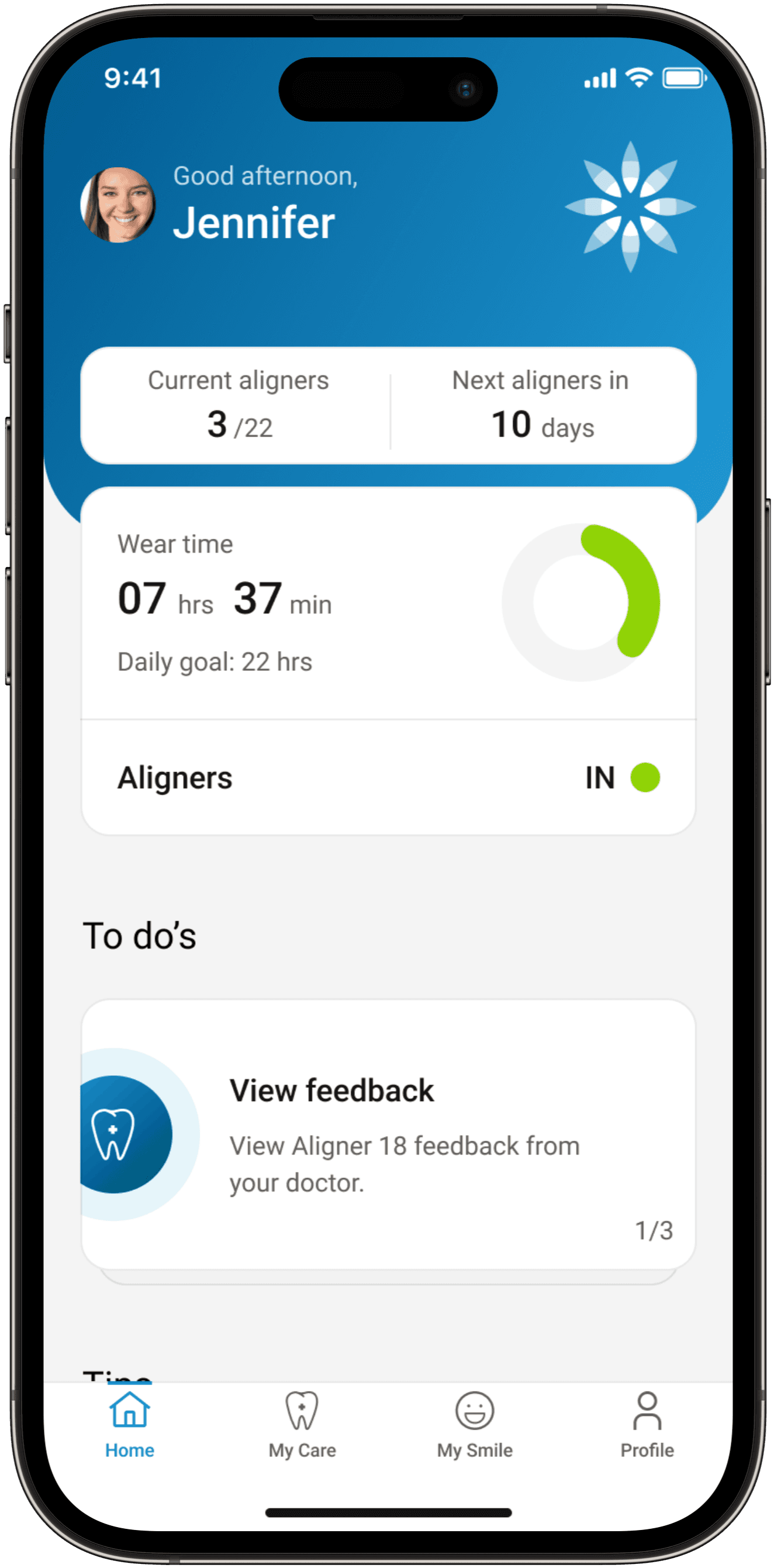
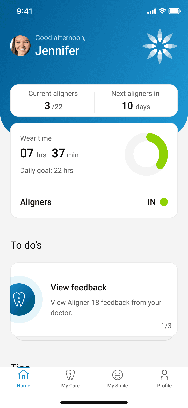
HOME — OVERVIEW
HOME — OVERVIEW
Know where you are at in your treatment at a glance and take actions.
Know where you are at in your treatment at a glance and take actions.
Know where you are at in your treatment at a glance and take actions.
Get advice to begin your treatment with ease & discover other Invisalign offerings
Get advice to begin your treatment with ease & discover other Invisalign offerings
Access tips and tricks to get started with treatment and discover additional offerings.
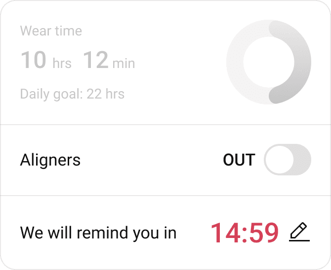
AUTOMATED TRACKING
AUTOMATED TRACKING
BACKGROUND
BACKGROUND
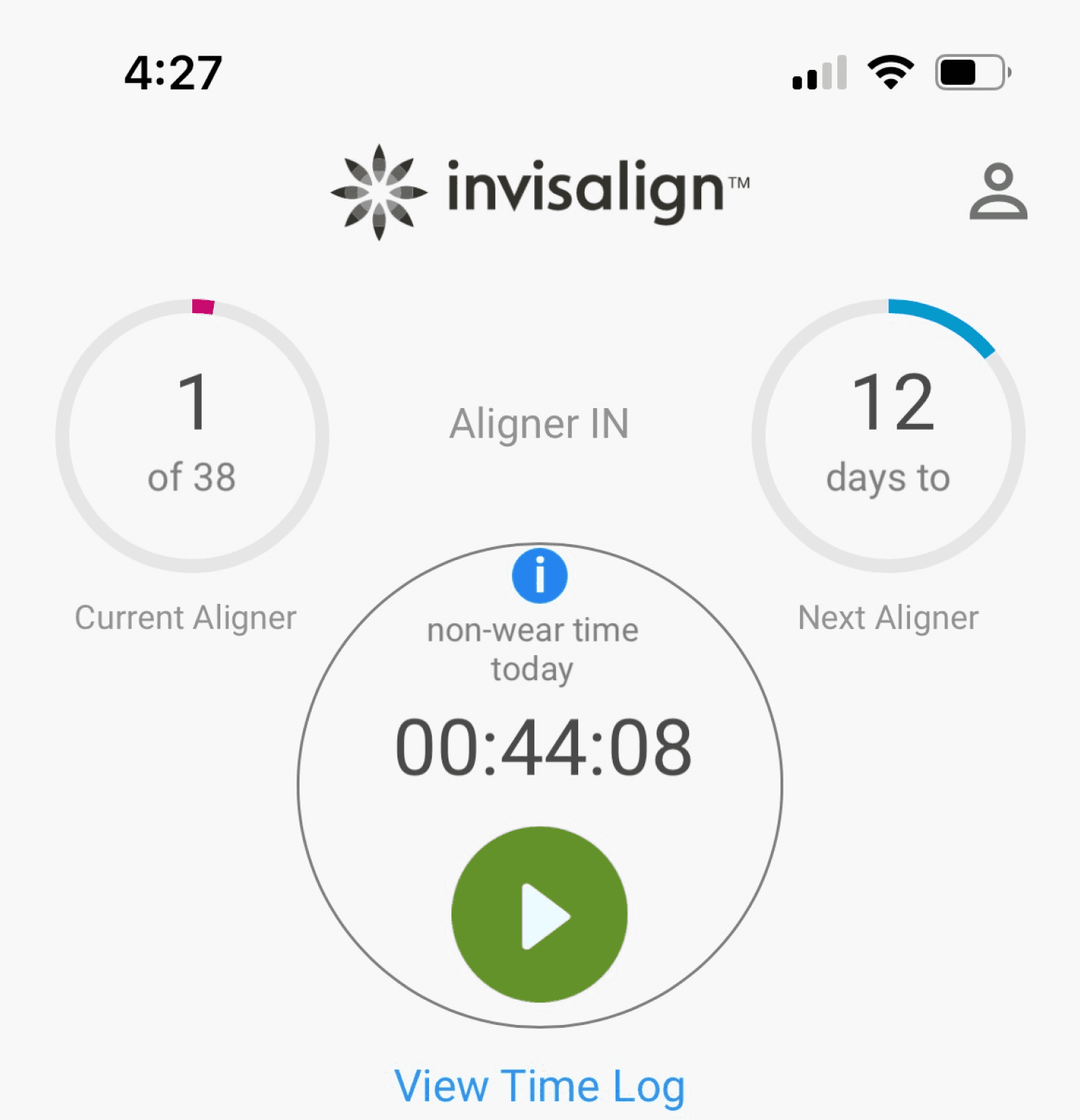
Previously, tracking wear time necessitated manual entry, which users didn't greatly appreciate due to the inability to seamlessly bridge the gap between hardware and software components. I collaborated with the R&D team to solve this problem.
Previously, tracking wear time necessitated manual entry, which users didn't greatly appreciate due to the inability to seamlessly bridge the gap between hardware and software components. I collaborated with the R&D team to solve this problem.
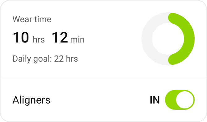
Monitor and manage your wear-time to stay on top of your treatment goals.
Monitor and manage your wear-time to stay on top of your treatment goals.
Monitor and manage your wear-time to stay on top of your treatment goals.
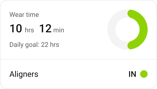
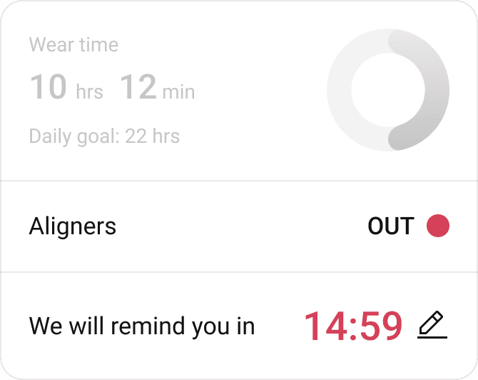
Dive in deeper for daily, weekly and monthly trends.
Dive in deeper for daily, weekly and monthly trends.
Dive in deeper for daily, weekly and monthly trends.
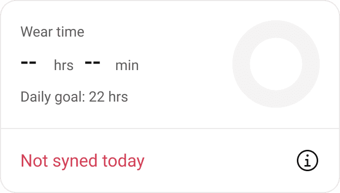
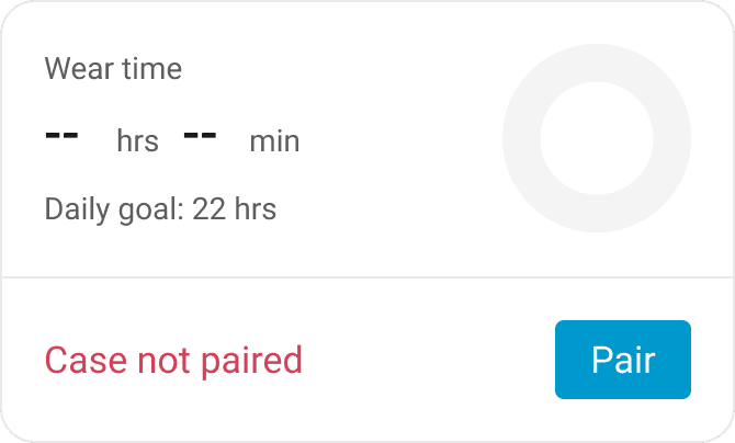
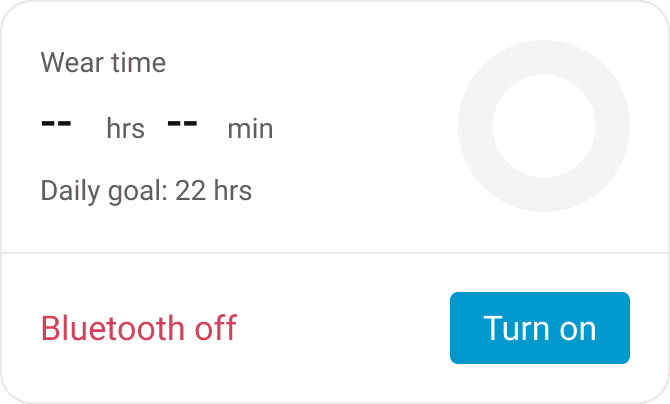
One card different states. Aligner wear tracking card was designed to reflect various states users might encounter.
One card different states. Aligner wear tracking card was designed to reflect various states users might encounter.
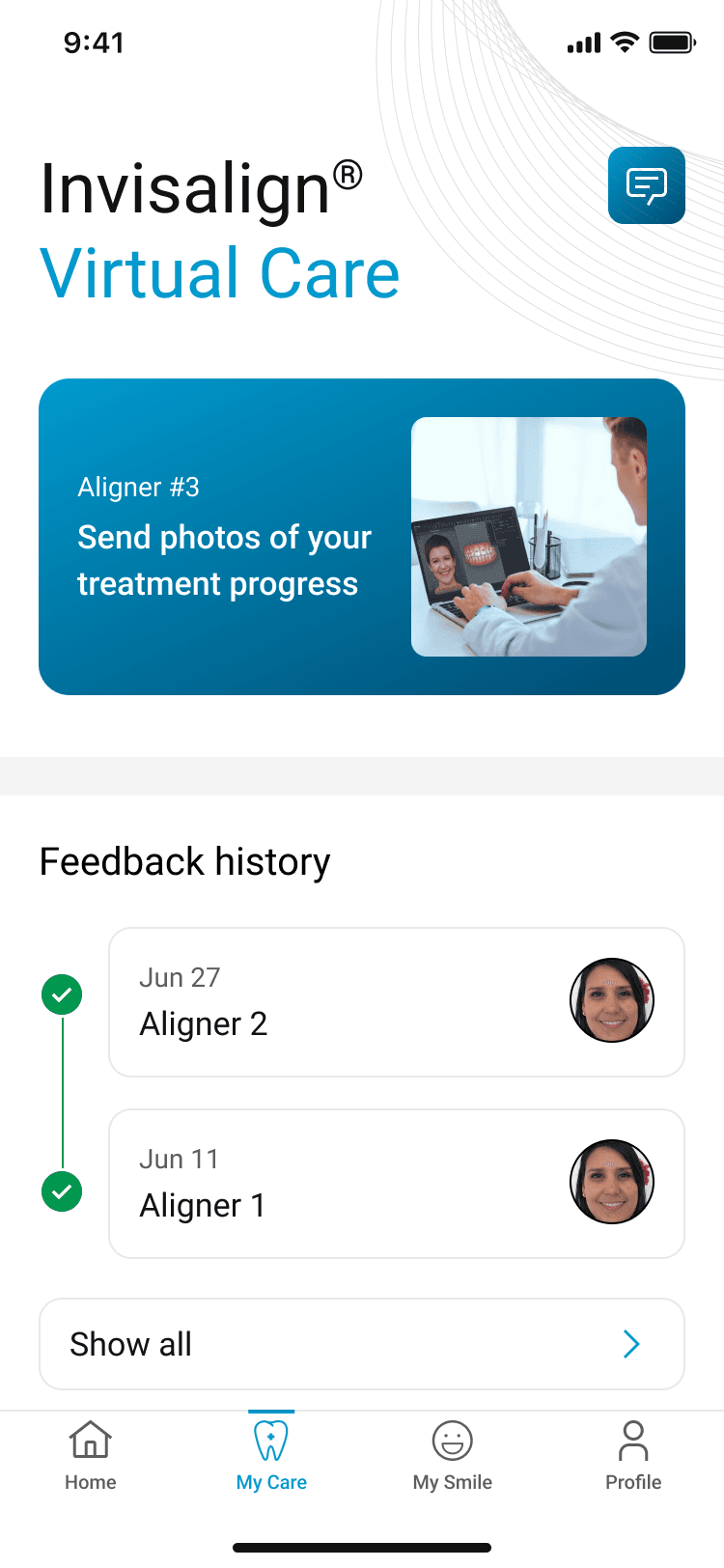
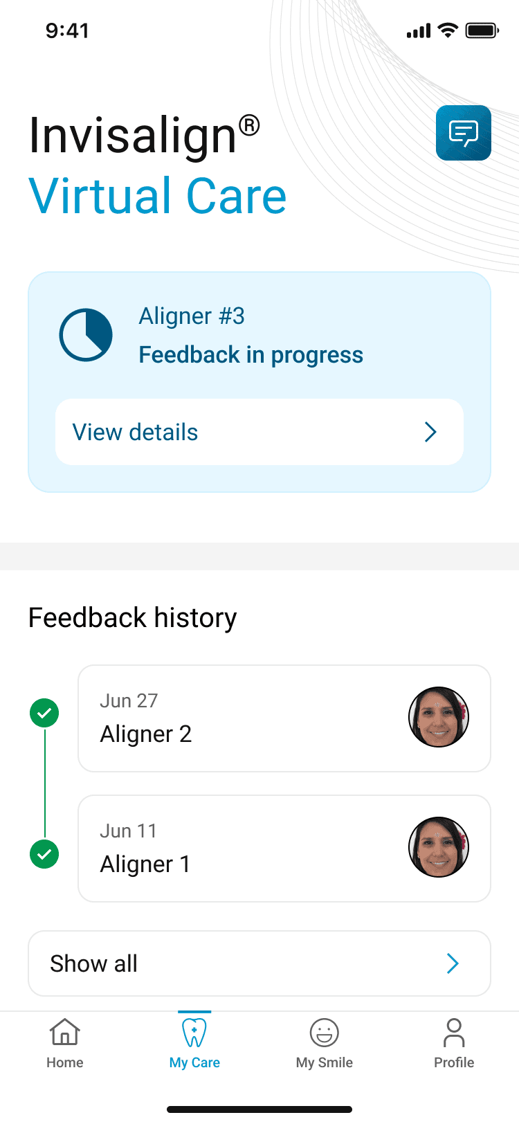
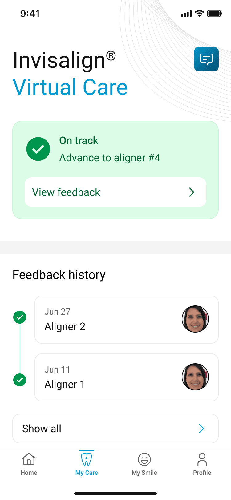
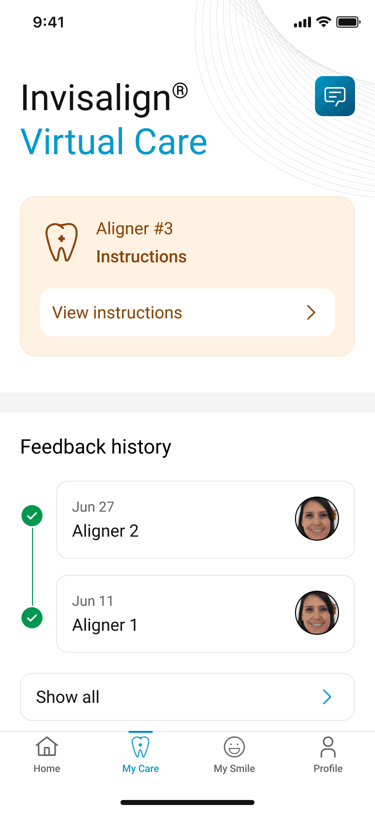
MY CARE
MY CARE
Quick background
BACKGROUND
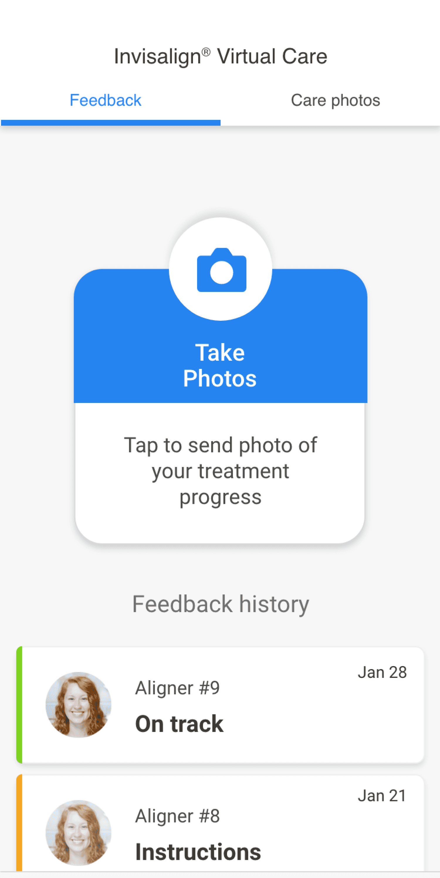
Virtual care enabled users to minimize number of office visits. Instead, of going to doctor's office, users could send a set of photos to the doctor and get feedback within 2 hrs.
In this revamp of patient experience, we addressed key usability issue.
Virtual care enabled users to minimize number of office visits. Instead, of going to doctor's office, users could send a set of photos to the doctor and get feedback within 2 hrs.
In this revamp of patient experience, we addressed key usability issue.
UX ISSUE
UX ISSUE
Users were advancing to next aligner stage prior to sending photos or receiving guidance to advance.
Users were advancing to next aligner stage prior to sending photos or receiving guidance to advance.
Simple and guided virtual check-in experience.
Simple and guided virtual check-in experience.
Simple and guided virtual check-in experience.
Get feedback and stay connected with your doctor.
Get feedback and stay connected with your doctor.
Get feedback and stay connected with your doctor.
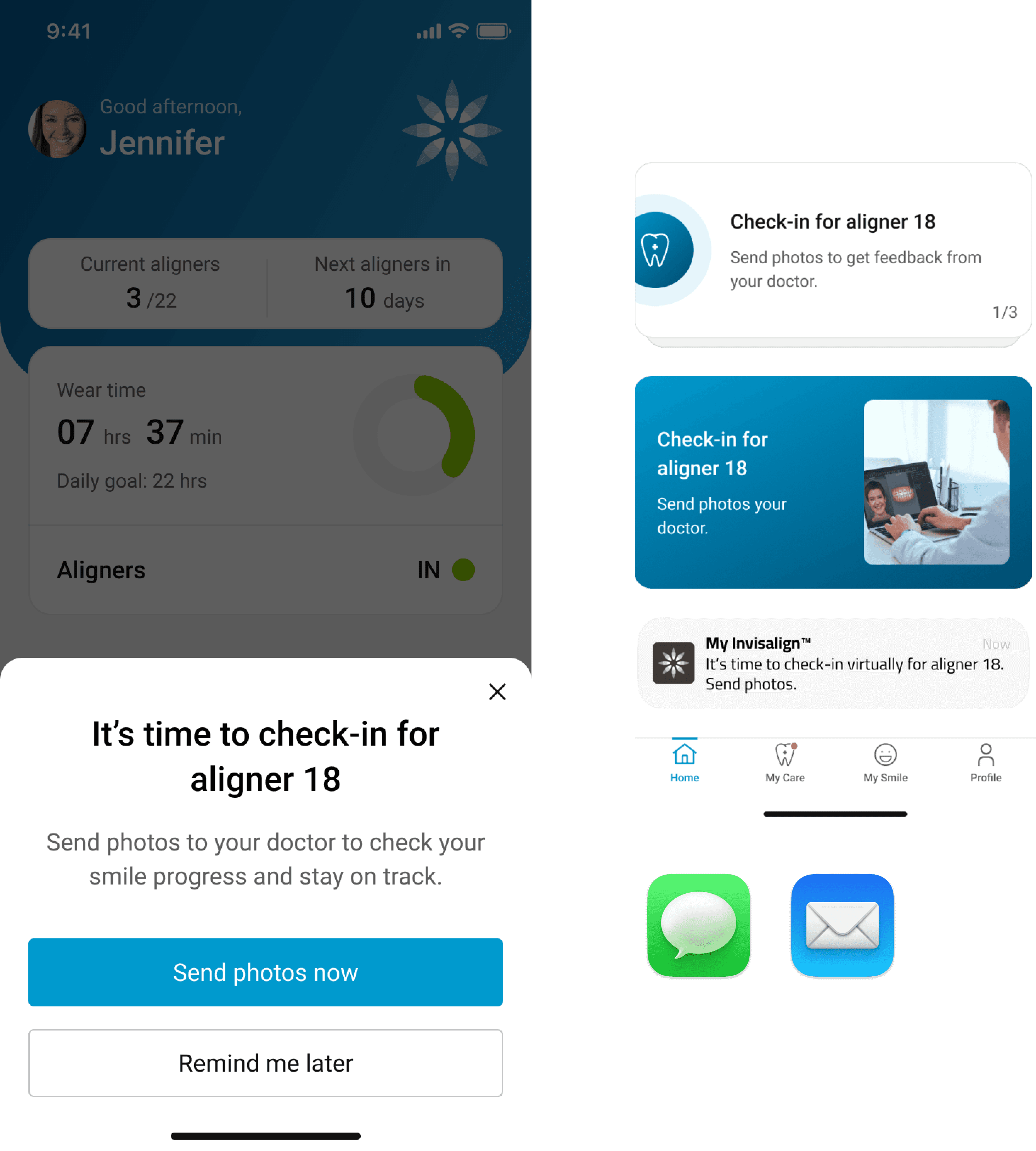
Reminders you can't miss.
Reminders you can't miss.
Reminders you can't miss.
User research findings
We conducted moderated usability study with 6 patients going through the treatment to evaluate the new virtual care experience. Findings are captured below:
User research findings
We conducted moderated usability study with 6 patients going through the treatment to evaluate the new virtual care experience. Findings are captured below:
New organization created better focus and guidance.
New organization created better focus and guidance.
Action card content provided clear context.
Action card content provided clear context.
Aligner phase validation established correct context.
Aligner phase validation established correct context.
Patients greatly valued the option to message their doctor.
Patients greatly valued the option to message their doctor.
Synchronized virtual care timeline with aligner stage eliminated discrepancies and uncertainty.
Synchronized virtual care timeline with aligner stage eliminated discrepancies and uncertainty.
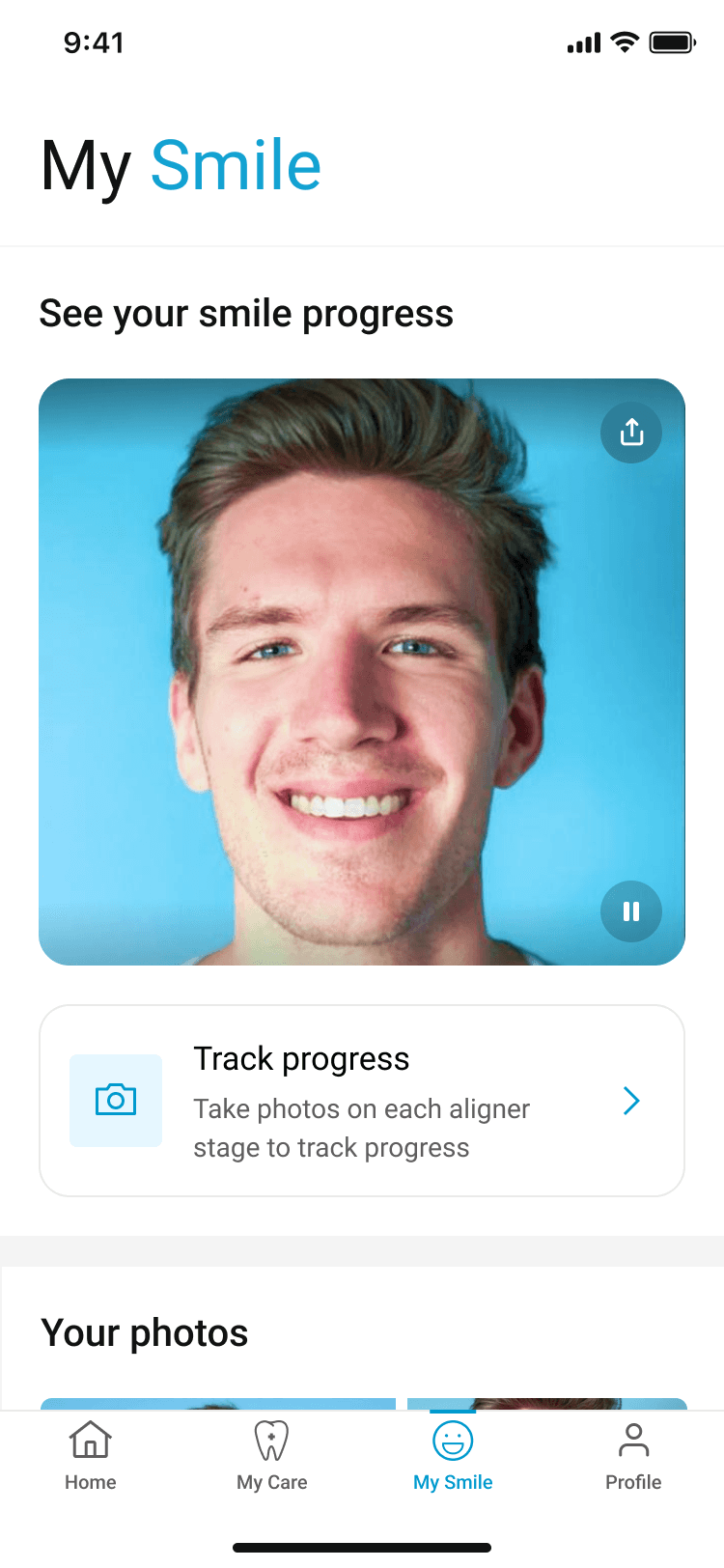
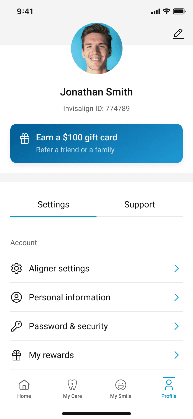
MY SMILE & PROFILE
MY SMILE & PROFILE
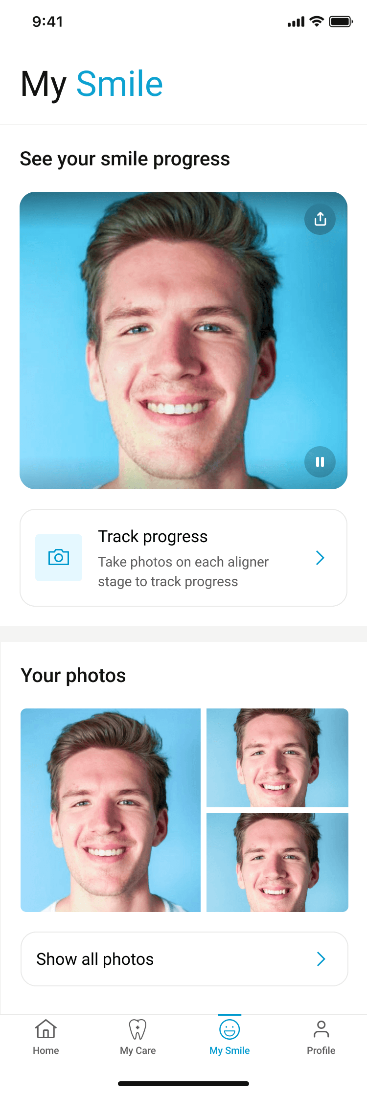
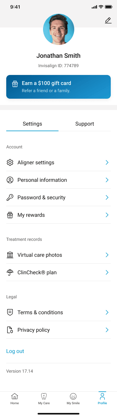
My smile feature enabled users to visualize the progress. App reminded users to take pictures throughout the time to generate a transformation video. For phase 1, we tweaked the organization of the page and gave it a simple face lift for consistency. All other enhancements were added in the backlog for future releases.
Profile page was redesigned and reorganized focusing on discoverability and efficiency of use.
THE CREATIVE PROCESS
THE CREATIVE PROCESS
I owned the end-to-end creative process from defining the information architecture, to conceptualization, research and visuals.
I owned the end-to-end creative process from defining the information architecture, to conceptualization, research and visuals.
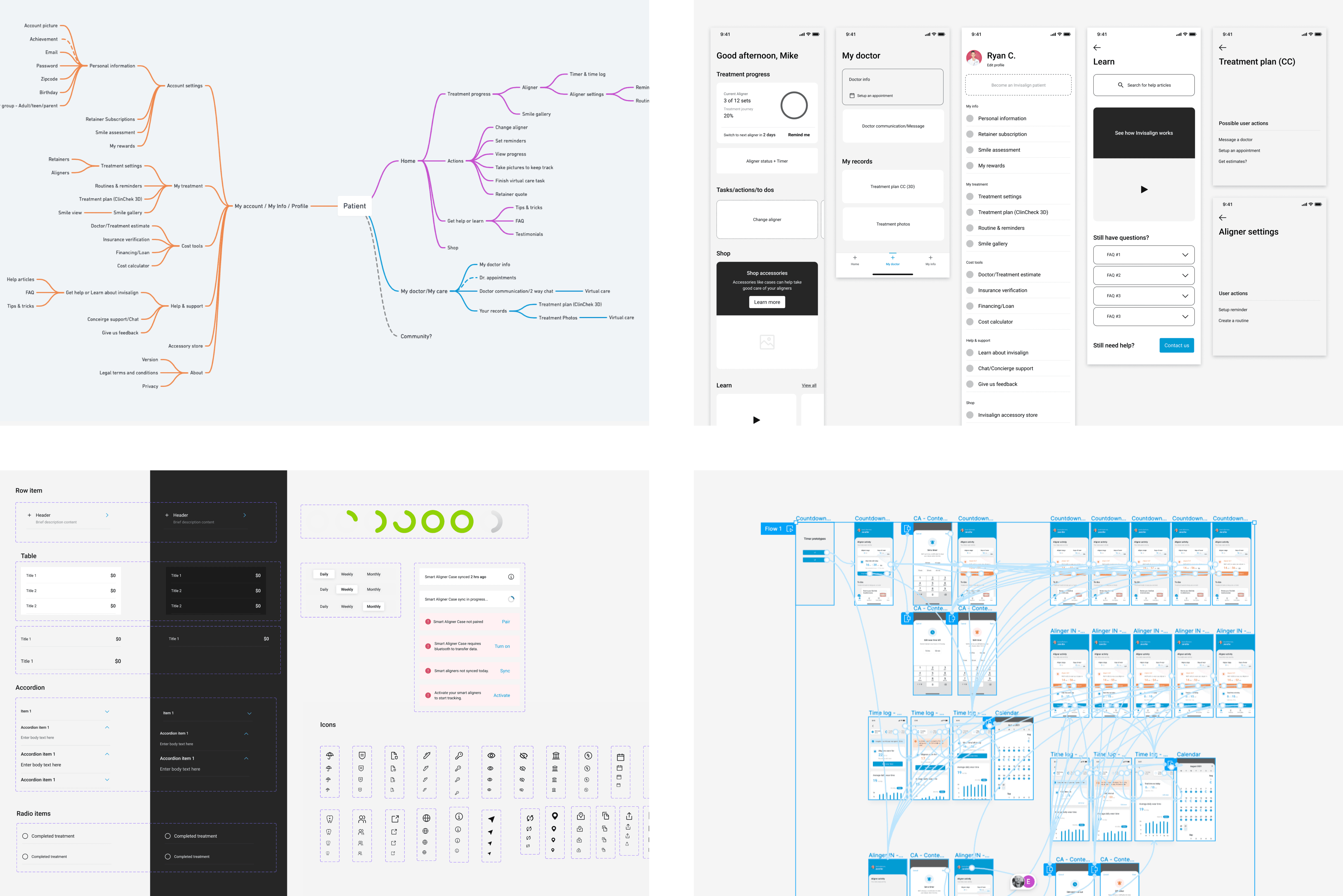
User testing
User testing
Card sorting
Card sorting
We defined simple and scalable information architecture based on the insights gathered from 100+ users.
We defined simple and scalable information architecture based on the insights gathered from 100+ users.
Usability study
Usability study
We conducted moderated study with 6 users to evaluate new patient experience.
We conducted moderated study with 6 users to evaluate new patient experience.
Key findings
Key findings
App organization, hierarchy and layout was clear and obvious for all the users
User appreciated aligner information and change information
Users were able to intuitively interact with new version of manual tracking card.
Tracking information shown was clear.
In comparison to old version, users found the app to be much more clear, simple, guiding and appealing.
Results & Impact
RESULTS & IMPACT
Utilizing a User-centric design approach, we revamped the patient experience from the ground up, addressing numerous usability concerns and improving the most utilized features. Upon launch, we will use app telemetry, UX camp and surveys to continuously evaluate and enrich patient experience.
Utilizing a User-centric design approach, we revamped the patient experience from the ground up, addressing numerous usability concerns and improving the most utilized features. Upon launch, we will use app telemetry, UX camp and surveys to continuously evaluate and enrich patient experience.
Thanks for reading!